The Project Overview
Learnly is a digital dashboard created to help students monitor their academic performance in real time. With growing academic pressures and fragmented access to information, students often struggle to stay updated on their grades, attendance, assignments, and progress. Learnly aims to bridge that gap by consolidating critical academic metrics into one intuitive, responsive interface—empowering students to take control of their educational journey.
This project was driven by a Human-Centered Design (HCD) approach, ensuring that every decision—research, strategy, and UI—was anchored in student needs, expectations, and goals.
Design Goals

Centralize essential student data in a single view
Ensure quick-glance usability for busy parents

Make performance tracking engaging and empowering for students
Use clean visuals, intuitive layout, and responsive design
Empathize
To truly understand the users of Learnly, I conducted surveys and one-on-one interviews with both parents and students. These conversations revealed a common frustration: academic information was fragmented across multiple platforms, making it difficult to stay informed and engaged. Parents wanted quick snapshots of their child’s progress, while students wanted to track their academic standing without feeling overwhelmed. This phase was critical in grounding the project in real-world challenges and underscored the need for a unified, easy-to-navigate platform.


Define
Using insights from the empathy phase, I created two primary personas:
Ram, a busy parent who needs timely, digestible updates
Ria, a high school student eager to track her academic progress independently
These personas helped humanize the problem space and ensured we kept both users’ needs at the center of the solution. From this, I defined the core problem: users needed a simple, visual way to stay informed about academic activities and performance. This clarity shaped all subsequent design decisions.


Ideation
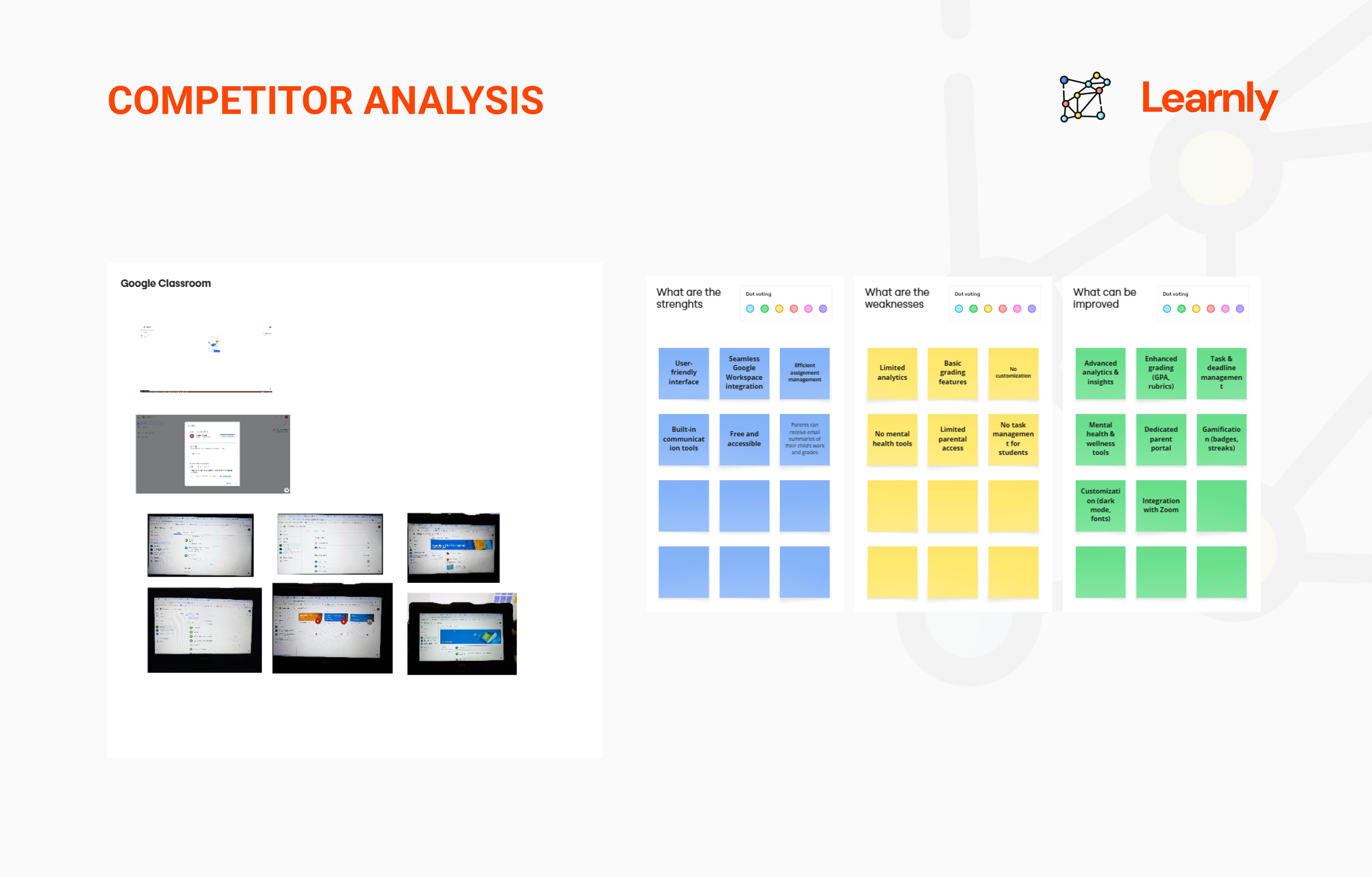
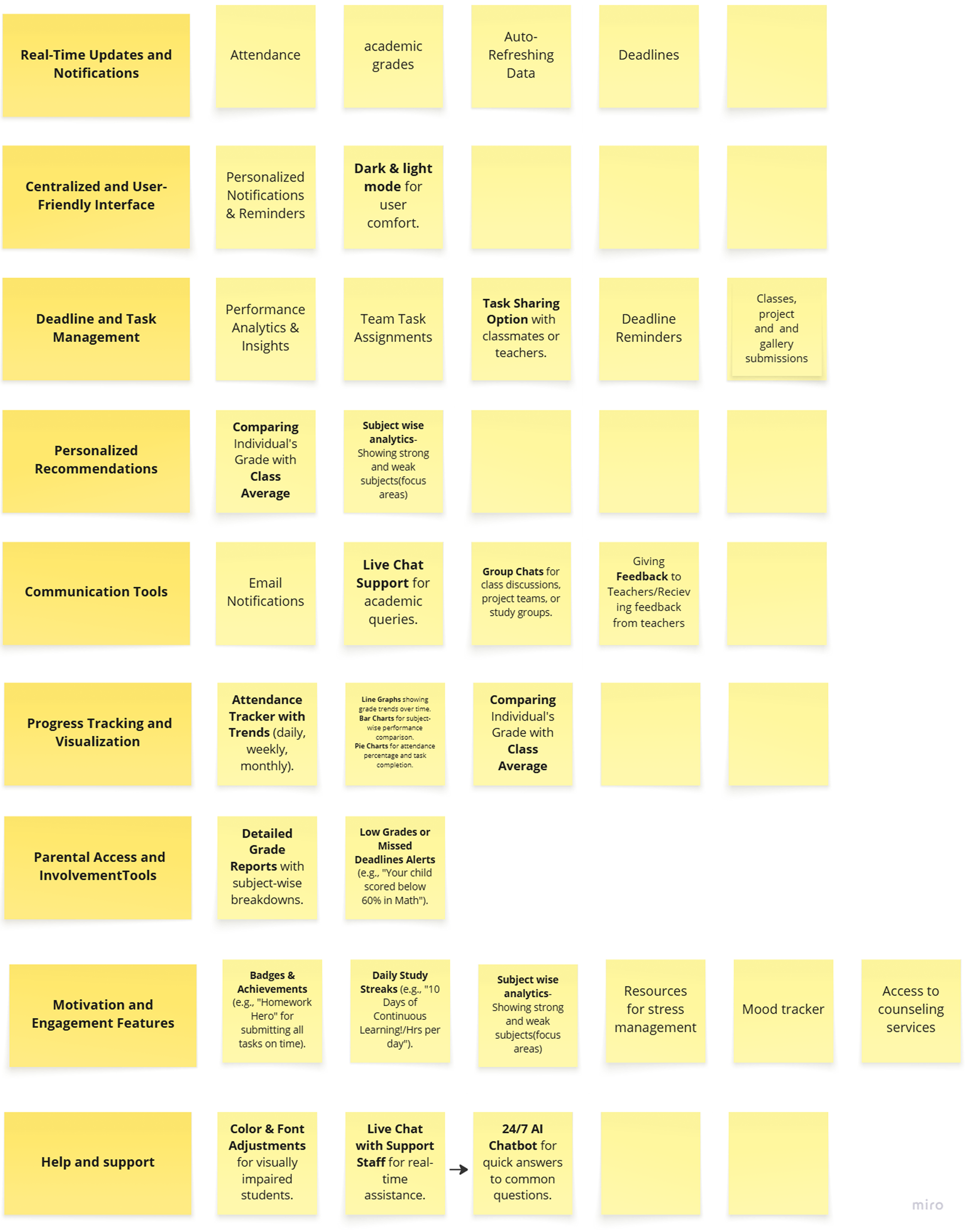
Grounded in the insights gathered during the empathy and define phases, I began exploring ways to bring clarity and relevance to the dashboard. I focused on identifying the most meaningful features that would support students and parents alike. These included grades, attendance, behavior alerts, and upcoming events—all directly mentioned in interviews and surveys.
I translated these needs into low-fidelity wireframes, which helped visualize how key performance indicators (KPIs) could be surfaced prominently on the landing page. Organizing them as individual widgets, I ensured that users could quickly scan for updates without being overwhelmed. The layout and content structure were designed to reflect users’ priorities, making information accessible and contextually grouped.

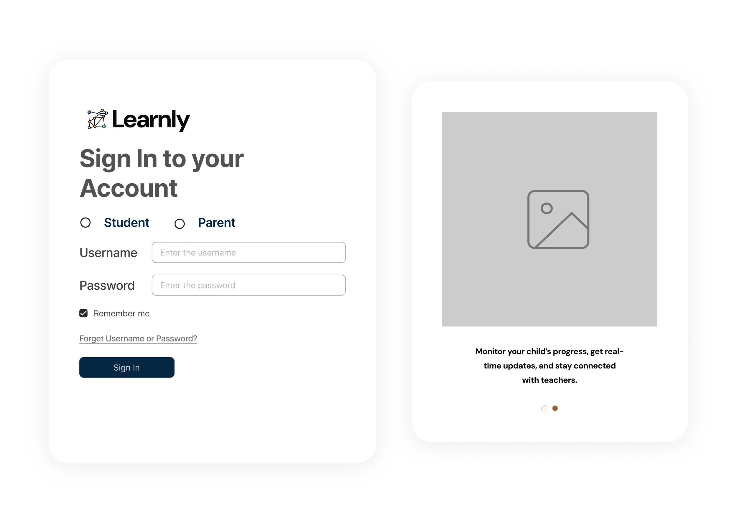
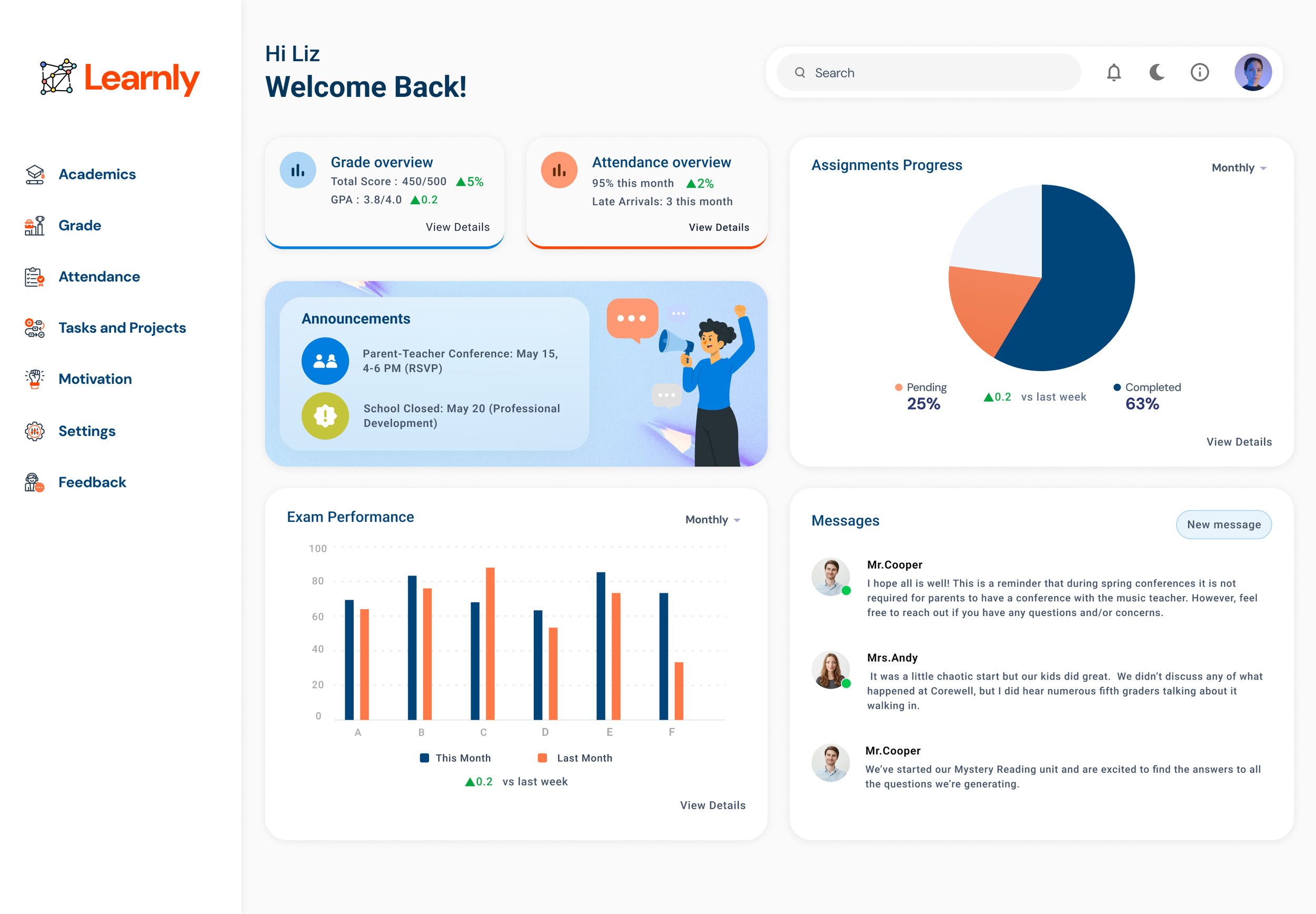
Design & Prototype
Once the core layout and content blocks were defined through wireframes, I transitioned to high-fidelity mockups using Figma. The interface maintained a card-based design system, allowing each widget to act as a self-contained unit of insight—ideal for quick decision-making.
I incorporated a student-friendly visual style, using soft colors, clean typography, and intuitive iconography. Labels were simplified for clarity, and progress indicators were visualized through colorful cues to support both comprehension and motivation. The final design ensured a balance between parent usability and student engagement, staying true to the personas developed earlier in the process.


Conclusion
The Learnly Student Dashboard was more than just a UI project—it was a response to real concerns voiced by students and parents navigating fragmented academic platforms. By anchoring the process in human-centered research, I was able to design a solution that brought clarity, accessibility, and motivation to users who needed it most.
From low-fidelity sketches to a fully designed, card-based interface, each decision was rooted in user insight—ensuring the dashboard remained informative without being overwhelming. Testing sessions validated the design’s intuitiveness and led to meaningful refinements, ultimately resulting in a product that was simple, engaging, and inclusive.
Key Takeaways:
Listening closely to users surfaces the real problems worth solving
Simplicity in design often requires thoughtful structure behind the scenes
Visualizing academic progress can transform how students and parents feel about learning
Learnly is a reminder that good design doesn't just inform—it empowers.