SOUTH EAST MICHIGAN COUNCIL OF GOVERNMENT-WEBSITE REDESIGN


The Project Overview
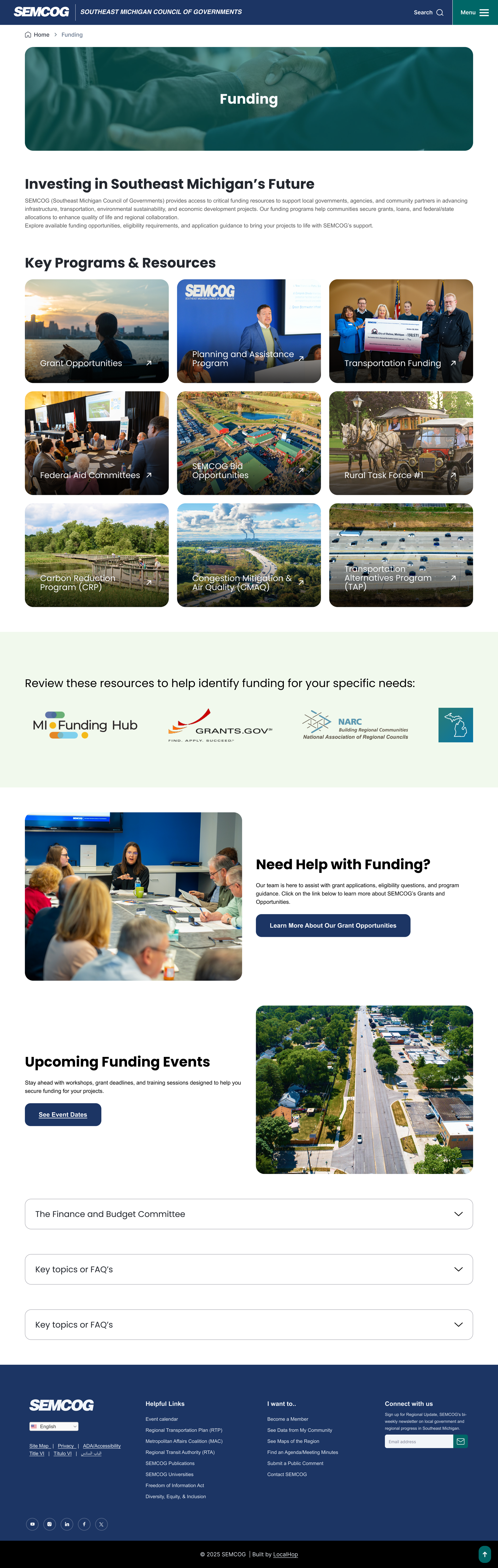
The Southeast Michigan Council of Governments (SEMCOG) initiated a comprehensive redesign of four of its websites, including the internal intranet site, SERG. The goal was to modernize the digital presence, improve usability, and ensure that both public-facing and internal platforms effectively served their respective audiences.
SEMCOG's existing websites suffered from outdated design, inconsistent user experiences, and poor mobile responsiveness, leading to challenges in usability and engagement. The lack of accessibility compliance hindered inclusivity for users with disabilities, while a cumbersome content management system made updates inefficient for staff. Additionally, slow performance, limited integration of dynamic data sets, and a fragmented ecosystem across multiple domains resulted in a disjointed user experience.
Addressing these issues was crucial to align with SEMCOG’s mission of fostering regional collaboration and providing accessible, user-friendly digital resources for Southeast Michigan’s diverse communities.
Team & Collaboration
This project was a collaborative effort involving a multidisciplinary team of three designers. Responsibilities were strategically divided to leverage individual strengths:
UX Planning: Collaboratively developed the overall UX strategy and project roadmap.
User Research: Led the research phase, conducting heuristic evaluations and user interviews to gather insights.
Design & Prototyping: Worked collectively on wireframes, prototypes, and visual designs to ensure consistency across all platforms.

While we collectively contributed to the overall design strategy, I primarily focused on the user research phase and supported the UX planning process. My contributions included:
Assisting in shaping the research approach and aligning it with project goals.
Conducting a heuristic evaluation of the existing site to identify usability issues.
Visiting the client location to facilitate in-person user interviews, conducted in batches to capture diverse perspectives.
Synthesizing research findings into meaningful insights that informed the structure and design of the new site.
Collaborating closely with teammates to ensure research insights were thoughtfully integrated throughout the design journey.
My role
Discovery
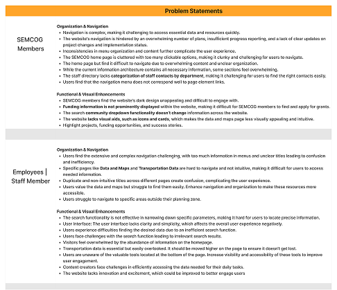
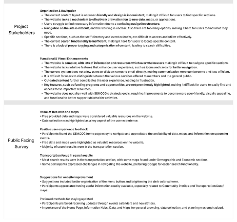
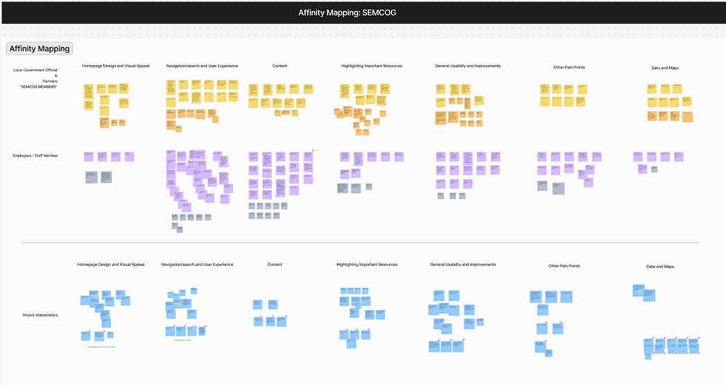
To better understand how users engaged with SEMCOG.org, we began with a heuristic evaluation to assess pain points across navigation, accessibility, and content structure. We followed this with stakeholder discussions and interviews with representative users, including local officials, researchers, and planners who frequently visited the site for data and reports.
Key findings:
Users struggled to find relevant reports due to deep and inconsistent page nesting.
The homepage felt overwhelming, with limited visual hierarchy.
Search functionality lacked precision, often returning outdated or irrelevant documents.


Define
From our research, we developed key personas such as “The Local Planner” and “The Policy Researcher.” These users sought timely updates, quick data access, and clarity around upcoming regional initiatives. We mapped their typical journeys—like downloading traffic data or accessing meeting minutes—and identified major roadblocks.
Problem statements included:
“How might we make regional data easier to locate for users with limited technical knowledge?”
“How might we help returning users access commonly used resources without relying on search?”
These statements informed our content strategy and helped prioritize what needed to surface early in the user experience.
Ideation
Guided by these insights, we explored design solutions that emphasized scannability, clarity, and ease of access. Wireframes focused on simplifying navigation into clearly labeled categories such as “Data & Maps,” “Plans & Projects,” and “Committees.” We proposed prominent “Quick Access” sections for top-requested resources and integrated visual cards to guide users to key regional topics.
We also evaluated design patterns that supported both first-time and returning visitors, ensuring content could be browsed or directly searched with equal ease.


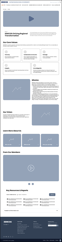
Design
In the design phase, we translated the refined ideas into high-fidelity prototypes using tools like Figma. I focused on creating a cohesive, visually appealing design that aligned with SEMCOG’s branding and core values.
I ensured the designs were mobile-responsive, WCAG-compliant, and optimized for accessibility. Interactive prototypes were developed to showcase features like the universal navigation bar and dynamic data tools, ensuring intuitive usability.
Regular feedback from stakeholders and usability testing helped me iterate the designs, addressing minor issues and refining details to create a polished final prototype ready for development.


Test
We shared the prototype with stakeholders and select users for feedback. The response was overwhelmingly positive, with appreciation for the streamlined layout, clarity of navigation, and visual prioritization of key content.
Improvements delivered:
Reduced homepage clutter through visual grouping and better content hierarchy
Streamlined navigation from 7+ confusing categories to 4 intuitive sections
Improved search precision and page discoverability
Conclusion
The SEMCOG website redesign successfully addressed the challenges of outdated design, inconsistent navigation, and limited accessibility. By prioritizing user needs and leveraging insights from research, testing, and iteration, I delivered a modern, unified, and user-friendly website ecosystem.
The redesign enhanced navigation efficiency, improved CMS usability for staff, and ensured WCAG-compliant accessibility for all users. With faster load times, multilingual support, and seamless integration of dynamic data tools, SEMCOG now has a scalable digital platform that aligns with its mission to serve Southeast Michigan’s diverse communities effectively.
This project reinforced the importance of a human-centered approach and collaboration in delivering impactful digital solutions.